The product
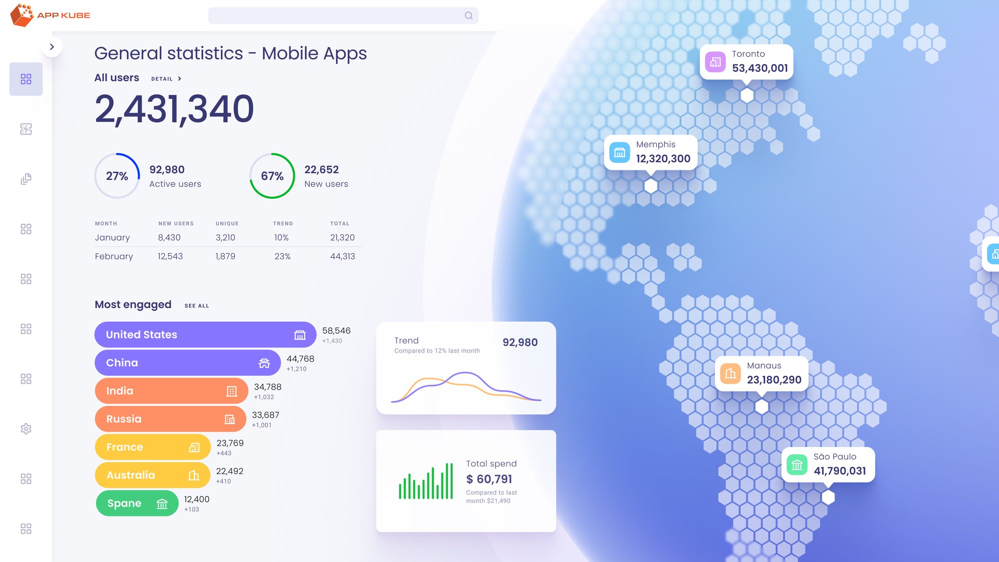
AppKube gives engineering teams one place to see everything they run across AWS, Azure and GCP: what it costs, whether it’s healthy, and how it’s all connected.
Who it’s for
DevOps engineers, cloud architects and IT administrators. People who live in consoles all day and have no patience for a dashboard that makes them hunt.
What I owned
UX and UI across the product for three years: the home dashboards, asset discovery, the environment and topology views, access control, sign-in, and the design system underneath all of it.
Mapping it first
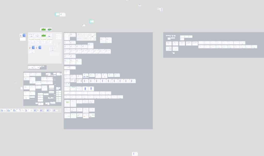
A multi-cloud product sprawls fast. Before drawing screens I mapped what lives where, and named every frame like a route, AppKube/Home/SpendAnalytics, so the map, the file and the prototype all read the same.
Home
- Spend analytics
- Cost analytics
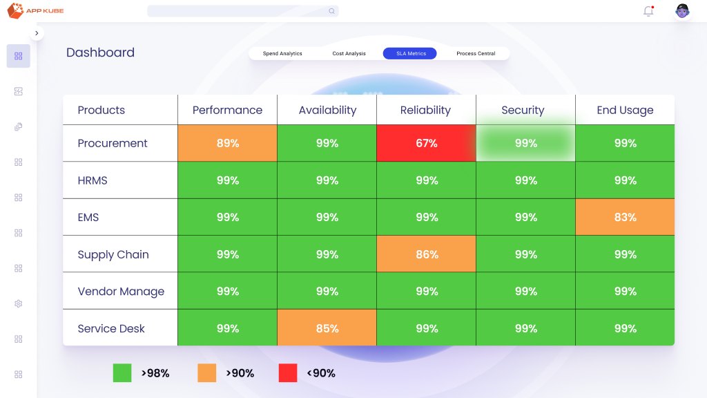
- SLA metrics
- Process central
Assets
- Environments
- VPC & clusters
- Application topology
- Discovered assets
- Global services
Centrals
- Dev central
- Sec central
- Ops central
Admin
- Roles
- Groups
- Users & profiles
- Account settings
Access
- Sign in & sign up
- Forgot & reset password
- System emails
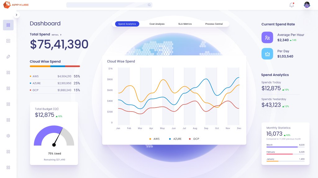
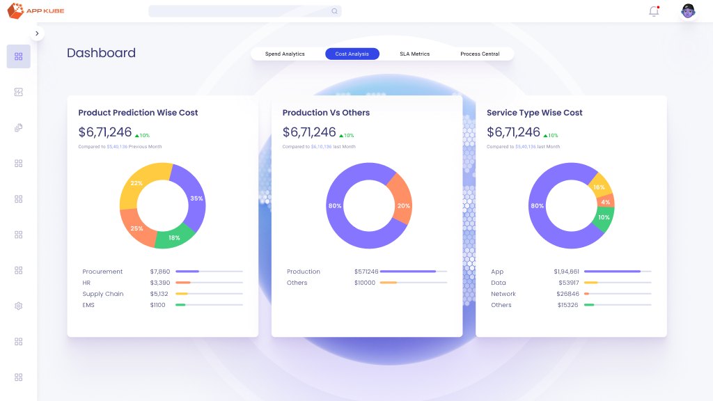
Home: four lenses on one estate
The home screen answers the question every lead asks first: are we OK, and what is it costing us? Instead of one crowded dashboard, it became four tabs, each one a single lens.
The drill-down
The core job: start at the cloud account and get to the one service that’s misbehaving. I designed it as a path where every screen answers exactly one question.
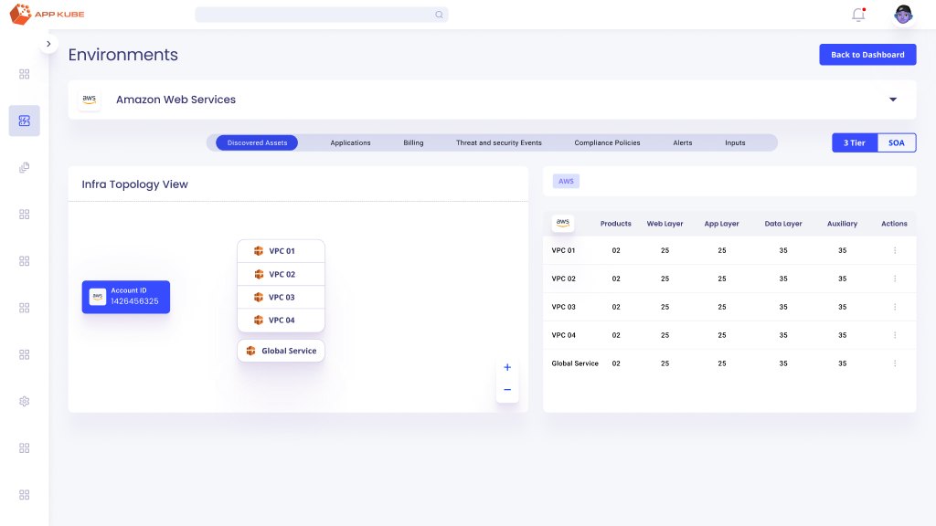
Environment. What’s running in this AWS account, per VPC? 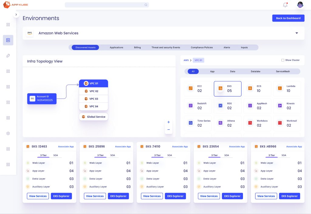
VPC. How are its clusters and services wired together? 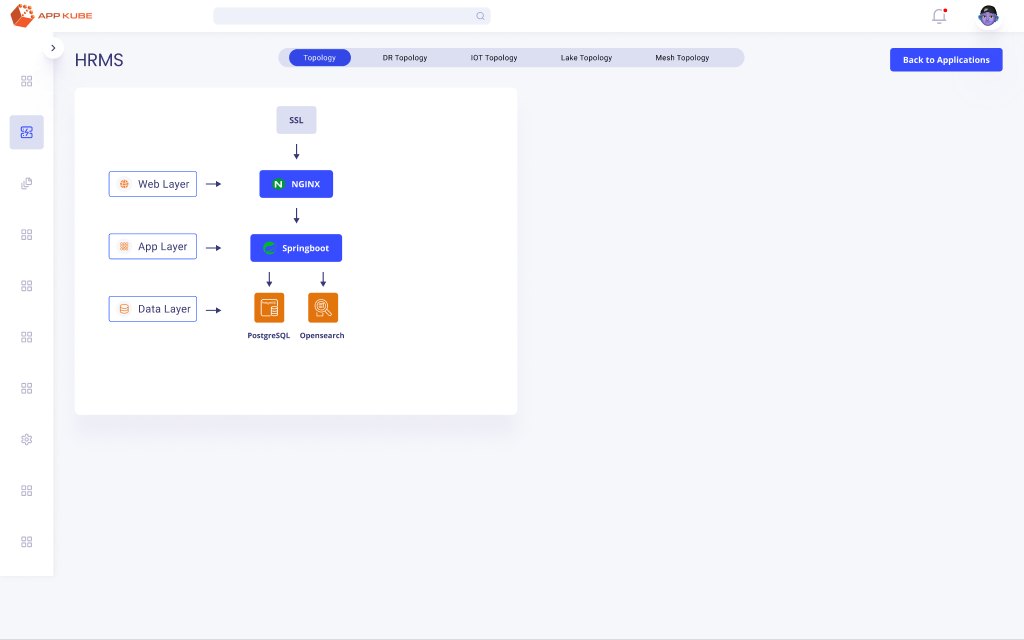
Application. Which layer, web, app or data, is the problem in?
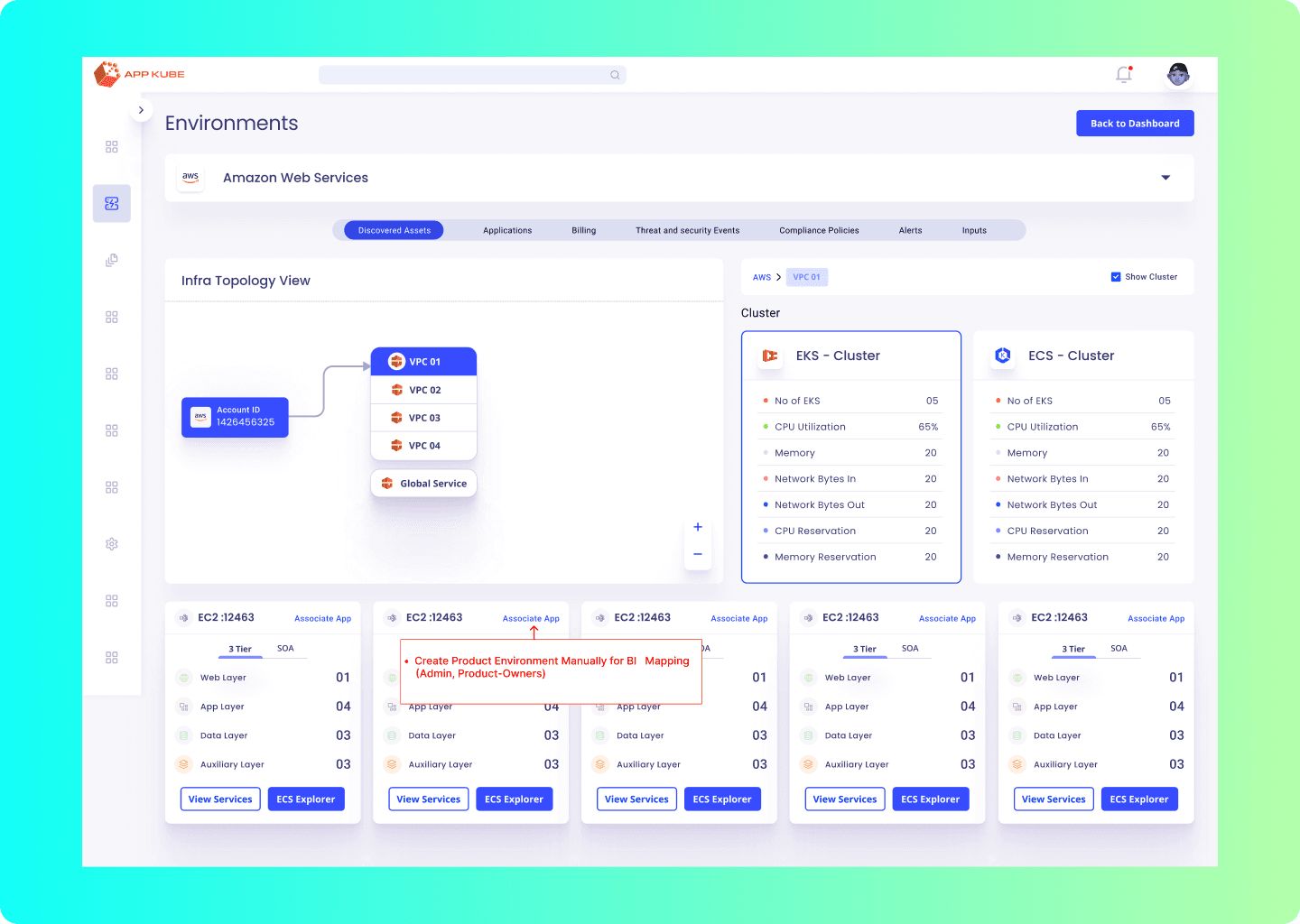
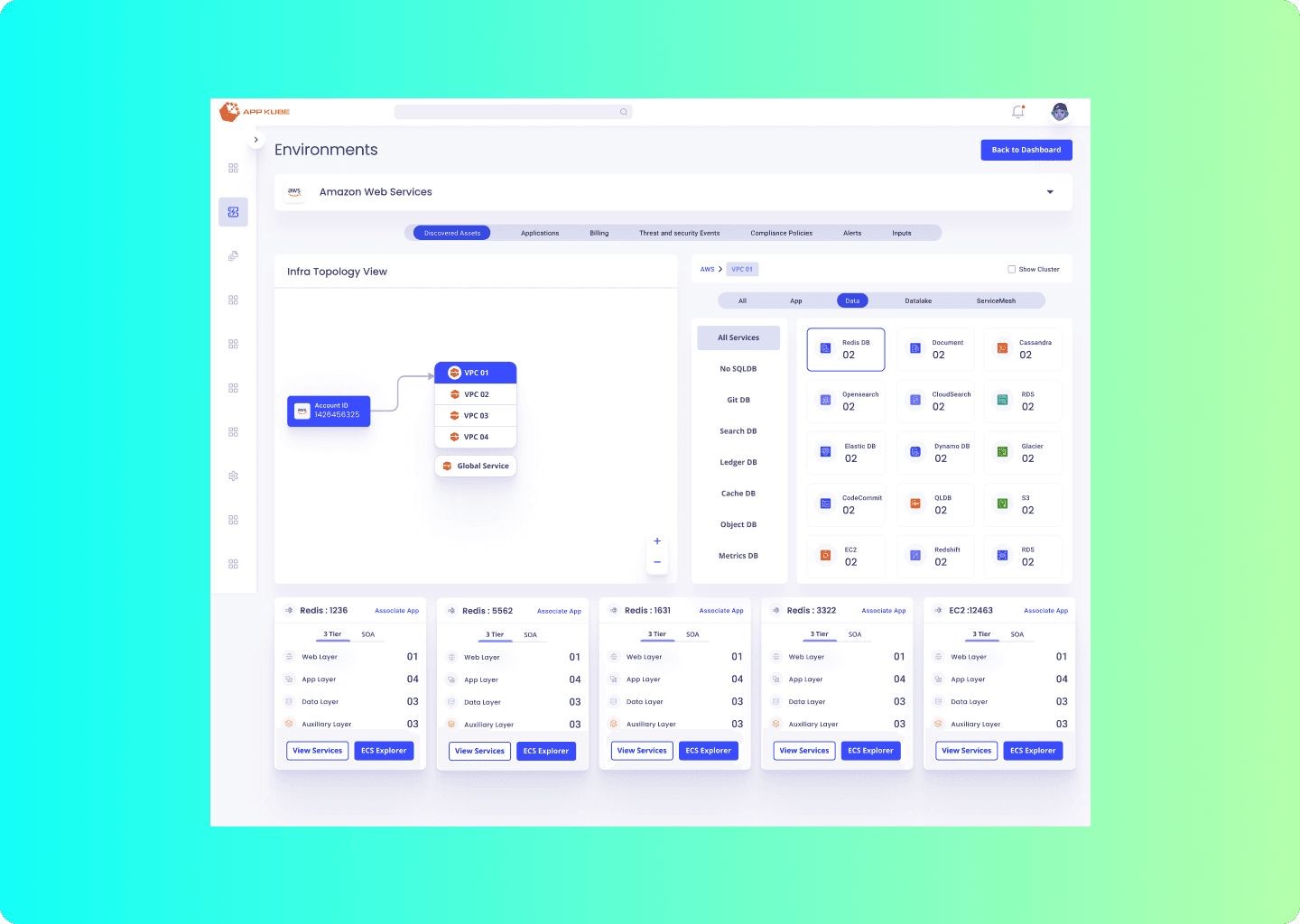
Redesigning the topology view
The topology view is the heart of the product, and it was failing. Users couldn’t read their own architecture in it. I led a 12–14 week redesign with two product designers and a product manager.
What was broken
- Hierarchy: VPCs, environments, architectures and services had no clear order
- Scale: big estates broke the layout
- Dead ends: no way to drill into an EC2 instance or a cluster
- Overload: everything shown at once, nothing prioritised
How I found out
- Interviews with DevOps engineers, cloud architects and IT admins
- A teardown of other multi-cloud monitoring tools
- Usage data from the old view: most-used components and paths
What changed
- A hierarchical view that makes relationships obvious
- A slot-based layout that holds thousands of resources without clutter
- Drill-downs straight to EC2, clusters and WAF
What testing showed
Usability testing pointed to a clear lift in satisfaction over the old view, a good sign for retention and adoption with enterprise teams.
The iterations
None of this landed first time. The file still holds every version I tried. These are the counts, straight from Figma.
Finding every asset
Discovery pulls in everything an account owns. The hard part is narrowing thousands of rows to the handful you care about, so filtering got as much design time as the table.
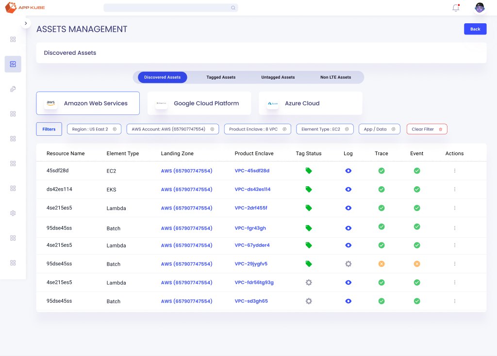
12 filters, each its own designed dropdown
- Region
- AWS account
- Service
- Product enclave
- Element type
- Namespace
- Resource type
- Tags
- Data source
- App / data
- Resource state
- Node
The system underneath
Dashboards this dense only stay consistent if the pieces are shared. Every screen is assembled from one library in the same file: 22 pages of components, charts and base styles.
Components · 14
- Avatar
- Alert
- Badges
- Buttons
- Checkbox
- Radio button
- Dropdown
- Switch
- Tab
- Tags
- Text input
- Tooltip
- Navigation
- Informers & indicators
Charts · 5
- Line
- Bar
- Horizontal bar
- Donut
- Sankey
Base · 3
- Typography
- Grid
- Colours
What I took from it
Name things like routes. Frames called AppKube/Home/SpendAnalytics made the prototype, the handoff and my own navigation of 164 screens far easier.
Keep the losers. Fifty-two versions of one screen looks like indecision. It’s actually the record of why the final one works.
A spike is a story. Reading a cost anomaly, finding the driver and deciding whether to act is the same loop whether the number is an AWS bill or a Meta ad set. I trained on it here before I ever owned a budget.
Client — the topology redesign was delivered for JP Morgan Chase & Co.