4core modules redesigned
4redesign goals
1design language across the platform
Figmaclickable prototype
The problem
A transport management system runs on dense data: loads, carriers, rates, drivers, documents and invoices. The redesign had to make that data easy to read and act on, without hiding any of it.
Goals of the redesign
- Enhanced usability: make complex data fields easy to understand and navigate
- Modern aesthetic: a design that makes a strong first impression
- Optimised information display: organise data-heavy screens without clutter
- Consistent design language: the same fonts, colours and components everywhere
What I redesigned
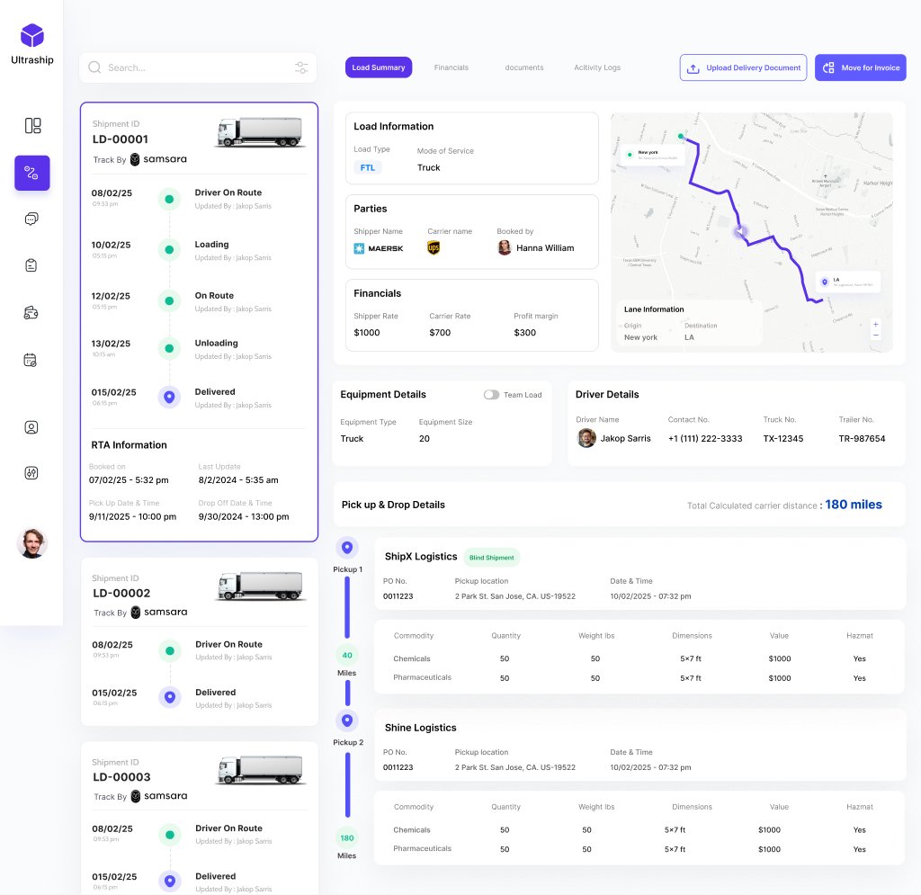
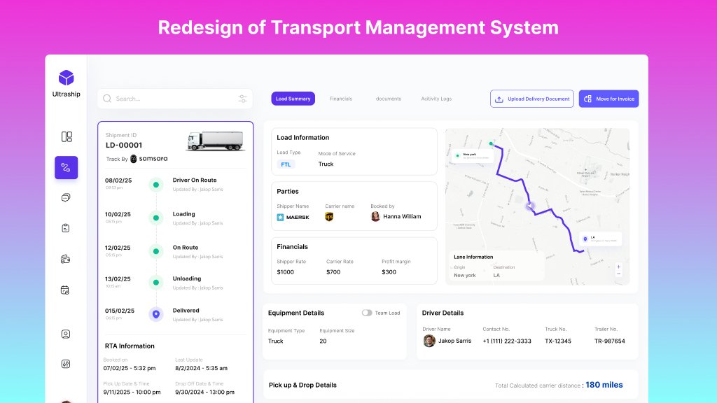
- Load details. Shipment timeline, lane map, parties, rates and profit margin, equipment and driver details, and multi-stop pickup and drop on one screen.
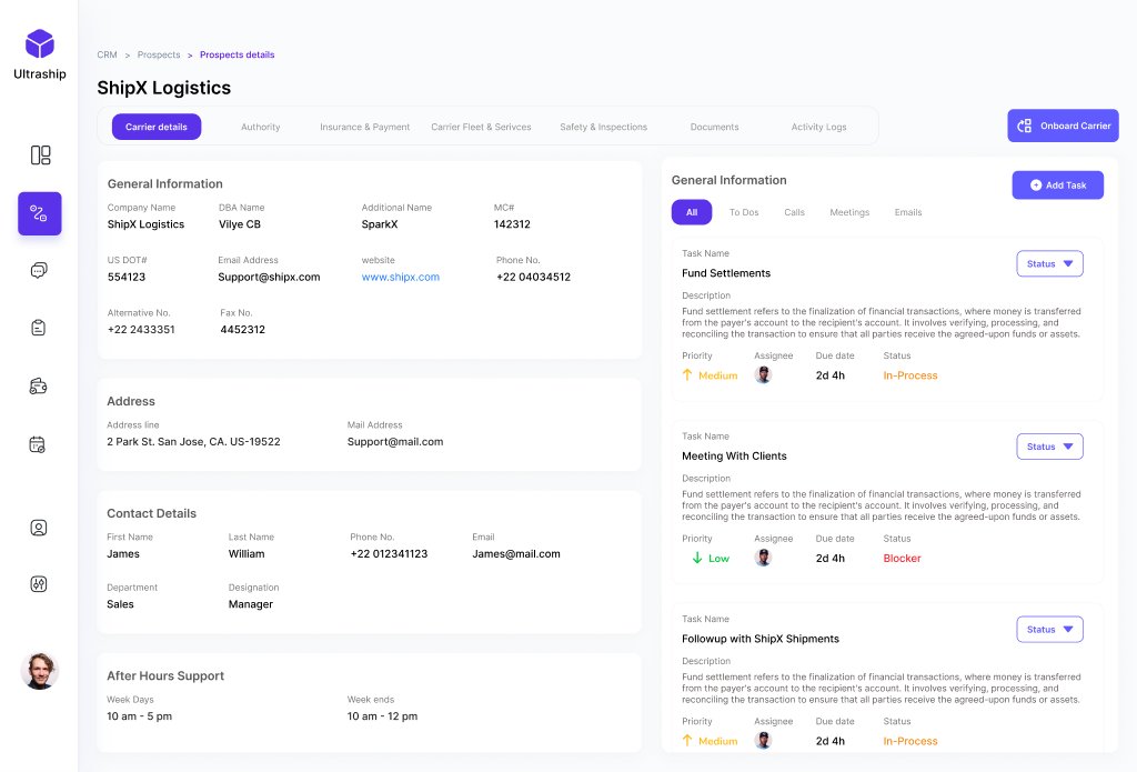
- Carrier CRM. Company, authority, insurance and safety details alongside tasks, calls, meetings and follow-ups.
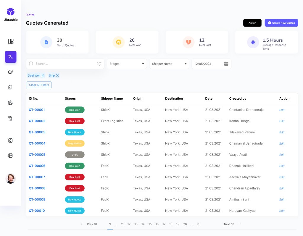
- Quotes. Quotes generated, won and lost, average response time, and a filterable pipeline by stage.
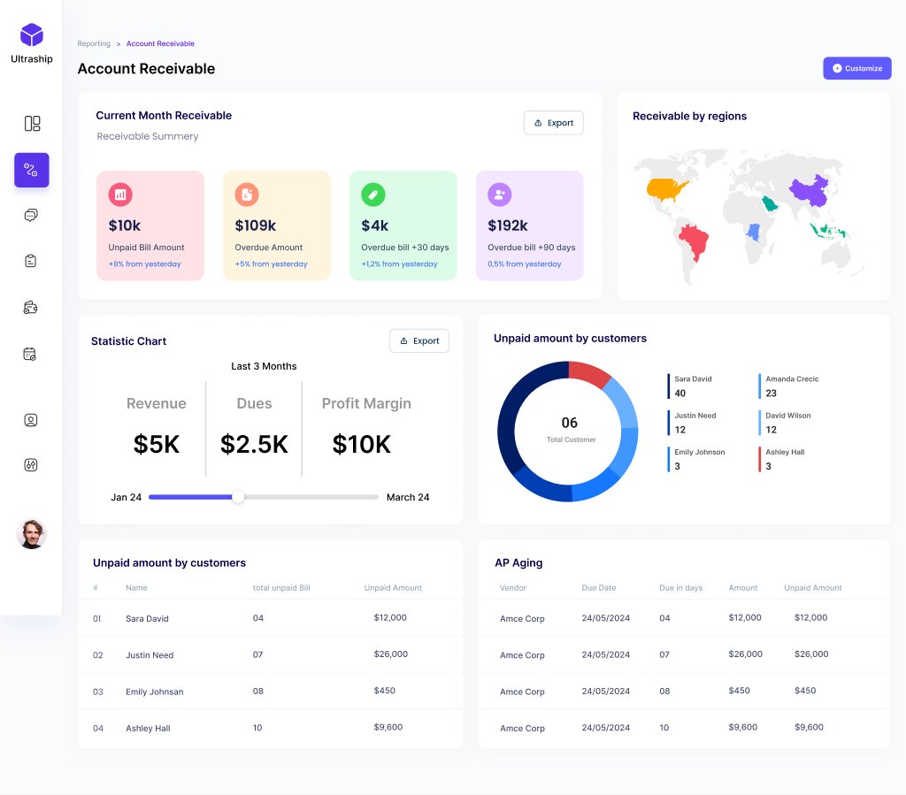
- Accounts receivable. Overdue buckets, receivables by region, unpaid amounts by customer, and AP ageing.
Design approach
Clean, easy-to-read layouts with a clear visual hierarchy. I grouped related information, used whitespace to give data room to breathe, and put the key numbers first. Enterprise systems like Microsoft Dynamics 365 served as references.